
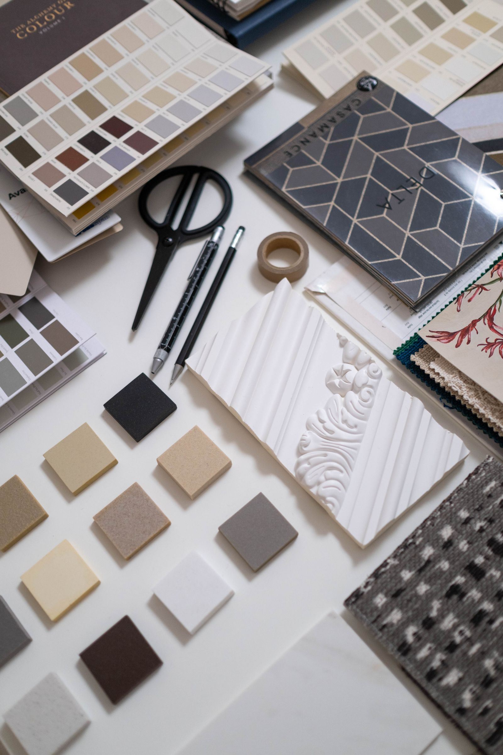
Colour theory becomes useful in interior design when it helps you make and explain a room decision. Instead of memorising palette labels alone, compare colours beside the floor, furniture and lighting they must work with. A colour relationship that looks convincing on a screen may behave differently in the actual space.
This exercise uses one room and a small group of samples. The outcome is a palette with reasons, not a universal formula for every interior.
Understand the terms you are comparing
Hue describes the colour family. Value describes how light or dark a colour appears. Saturation describes its intensity. A room can use related hues while varying value and texture, or introduce a stronger contrast through selected elements.
These qualities interact. Two colours may look similar in a small digital swatch yet create very different effects over large surfaces. Existing finishes and the light around them influence the comparison.
Start with what stays
Photograph the room with permission and list fixed or retained elements: floor, cabinetry, sofa and curtains where relevant. Obtain physical samples where possible. Choose one of those retained elements as the reference for your exercise.
If the room already has a strong timber tone or patterned floor, acknowledge it. A new palette should work with that constraint rather than pretending you are designing an empty room.
Create two palette options
| Option | Learning task |
|---|---|
| Related colours | Explore a limited colour family with changes in lightness and texture. |
| Controlled contrast | Keep a restrained base and test one contrasting element. |
Use the same retained furniture and floor reference in both options. This makes the comparison meaningful. Avoid changing every variable at once, because you will struggle to explain why one option works better.
Test samples in the room
Place the samples together near the surfaces they relate to. Observe them in daylight and under the usual evening lighting. Look from different positions rather than judging everything beside one bright window.
Use paint samples according to the product instructions and obtain permission before applying them to a wall. Keep the brand, colour reference, finish and test location in your notes. A photograph is a useful record, but it is not an exact colour standard.
Record the comparison
| Question | Your observation |
|---|---|
| How does the palette relate to the existing floor? | Describe the relationship and any conflict. |
| What changes after dark? | Record which samples appear different. |
| Where is contrast useful? | Identify the element and its purpose. |
| Does the palette support the user’s preference? | Refer to the actual brief. |
Do not assume that every person experiences or prefers colour in the same way. Discuss the scheme with the users and consider legibility and individual needs where colour carries practical information.
Present a reasoned choice
Select the option that best meets the brief and explain what you kept, changed and rejected. Pair the palette with a small material board so colour is considered with texture and finish. Check availability and price before treating a reference as a purchase decision.
Continue with the mood-board guide and the guide to colours and materials for a small Nairobi apartment. The goal is a scheme you can explain and test, rather than a palette copied without context.
Practise with Ujenzi College
Explore Interior Design Essentials for the current course scope, tuition and preparation requirements. Ask admissions about the next class.